Premium Business Cards
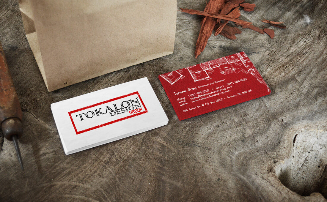
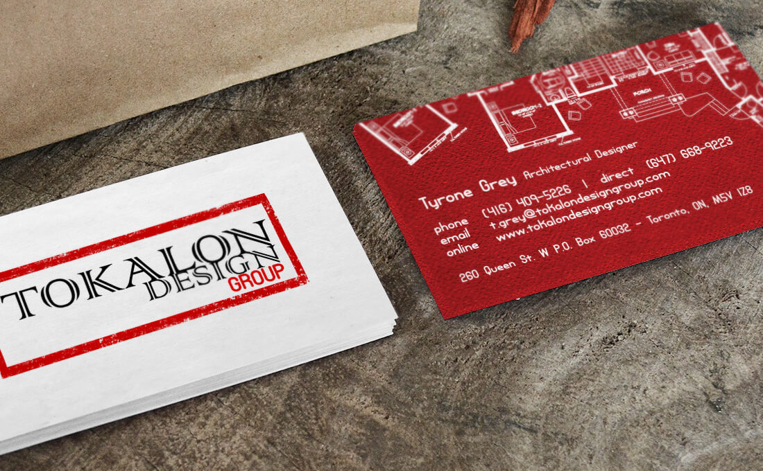
The very nature of Tokalon’s business resides in their development, planning, staging and designing. We wanted to emphasize this on their business cards so that they could get right to the point while they built rapport with their prospects. We created a double-sided premium, custom business card to immediately draw clients to the professionalism and integrity that this architectural design firm has to offer. The final product was printed on our premium 18pt card stock and finished with a matte lamination. Here you have it: Architectural Design meets Creative Design.
Client Testimonial
The best part about working with Cloud3.ca is their high attention to detail. They have professional processes in place that allowed us to connect with them completely throughout each and every aspect of our design project. Also, the fact that our entire digital business (hosting, website, print media, etc.) runs through one company is extremely beneficial to us. In our own business, we're avid believers of doing something right the first time and that's what you get with these guys as well. Kudos to Cloud3.ca and their entire team.
Tyrone Grey
Architectural Designer / Tokalon Design Group

