The Supreme Fitness logo really just need a quick facelift. We went with a clean font type and refreshed their colour scheme a bit to lighten up the tone of the brand. We boxed (rectangled) it all up and Bob’s your uncle!
Instead of sticking with their original dark (black and red) theme, we went clean with red and white while incorporating darker photographic elements throughout the new marketing initiative.
FINAL
ALTERNATIVE
Premium Business Cards
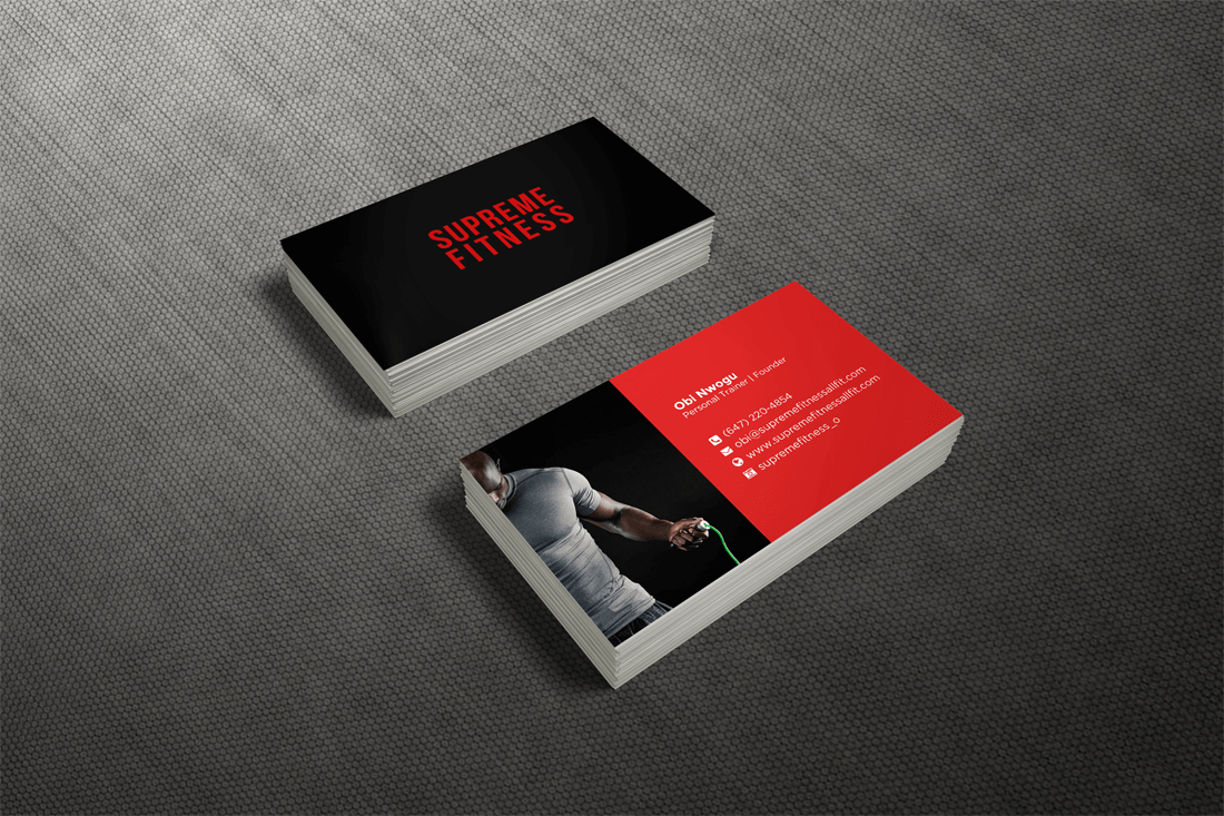
We took the business cards back to the darker theme using the alternative logo for a sleeker, more polished look. They had really liked a previous design that we used with some of our other clients (it’s really popular), so we re-worked and voila – this baby popped out. We opted to finish this card on our premium semi-glossy card stock for a clean, stunning finish.
Website Design
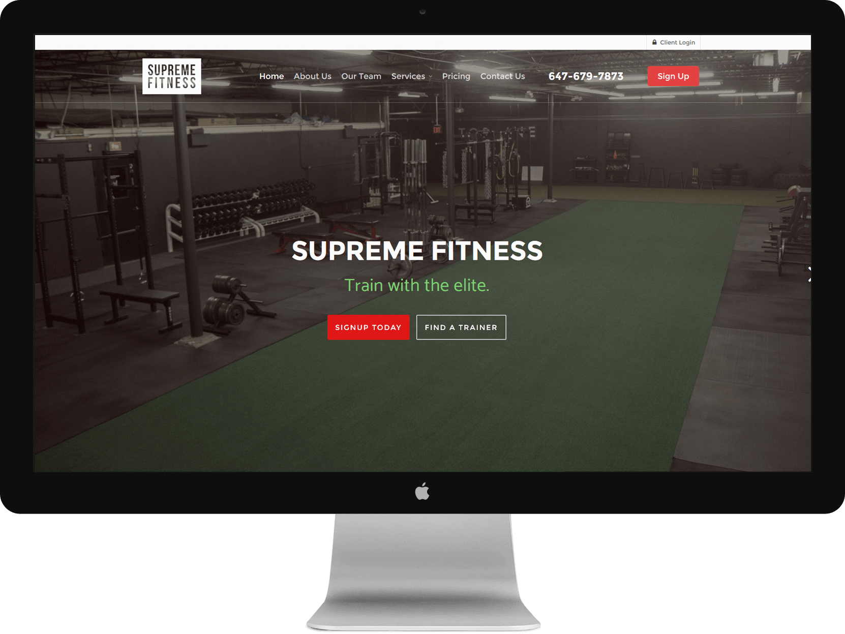
The Supreme Fitness website is a different kind of beast altogether. This was a completely custom website design package built on our FitPalPro scheduling platform. The website features an interactive group class scheduling system, custom client login area, automated emailing system, call-to-action galore and a completely integrated personal training booking system for their training staff. This puppy really pumps – BIG time.
DISCLAIMER: None of the Supreme Fitness personal trainers use steroids, but their website definitely does.