Logo Design

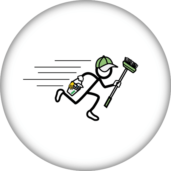
When RUN Janitorial first approached us to start the branding for their all-new cleaning business, this was the first thing they showed us; their “logo” (see below). We all kind of giggled to ourselves here at the office. It was a truly fun concept, but way too amateurish. Let’s be real: It looked like a high school kid made it in his computer class. And where does it say RUN Janitorial? Oh yeah. Way down there on the bucket where you can’t even make it out.

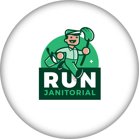
Well, we took their idea, ran it through our proven Logo Design process and we milked every penny out of it. What you’re left with is this beautiful masterpiece that’s still fun and amazing, but extremely professional, unique and timeless. And yes, it even fits corporate design standards now.

Fun Fact: Nazeela said the character sketch reminded her of an Italian man, so we nicknamed him Luigi!

BEFORE

AFTER

ALTERNATIVE

Business Card Design

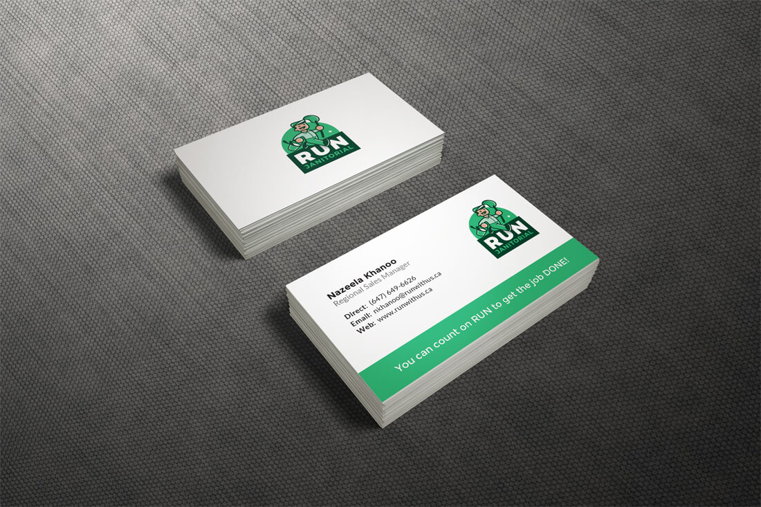
RUN Janitorial’s logo is already such a powerful part of their branding that their business card design needed to be simple. We used the fonts and colours from the branding guidelines we had created and put together this simple, yet stunning business card design. Yummy!
Website Design

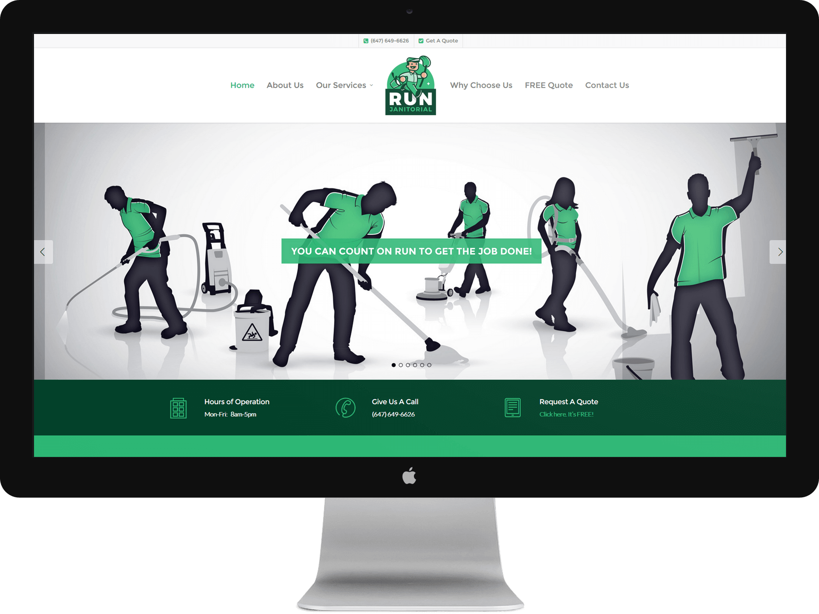
RUN Janitorial went with our Professional Website Design Package, so we created them a stunning 10-Page website with compelling graphics, contact forms, quote forms and all sorts of other standard features that we just make a whole lot cooler. Check it out for yourself: